To discover what caused production issues or to understand why a particular alert was raised, you need to conduct a Root Cause Analysis (RCA). An effective RCA session allows you to fix problems quickly and ensure that systems operate smoothly. However, in today’s complex cloud environments you might have to investigate many connected components before getting to the bottom of the issue.
In this article, we’ll describe how to use CloudMonix’s Historical Dashboard to effectively investigate production issues in complex Azure environments. If you’re not familiar with CloudMonix, it is a cloud service for Azure resources monitoring and automation.
Peek into the past with Historical Dashboard
The Historical Dashboard visualizes the whole environment you’re monitoring, not only the failing element, as it was when the issue occurred.
You can manually scroll your live dashboard back in time by unchecking “Live mode” slider in the top-right corner in the CloudMonix portal. Dashboards can scroll back in time for at least 1 month.
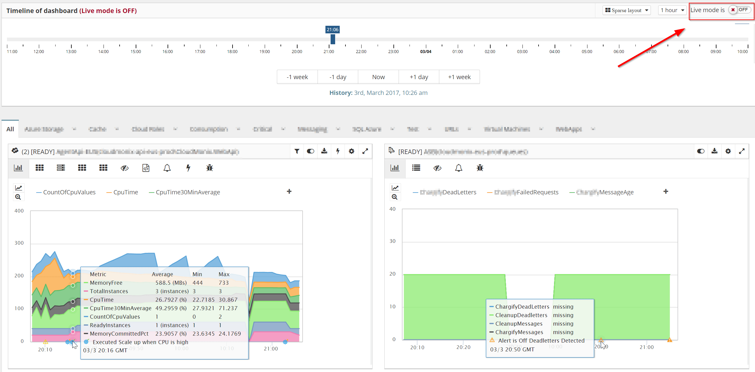
The historical dashboard is interactive. You can look at different resources, switch between various metric views, and interact with it as if it was live.
Navigate to the right moment with links to the Historical Dashboard
To save you time, when CloudMonix detects an issue it will send you a notification with a link to Historical Dashboard. After clicking the link, you’ll be taken directly to the exact moment when the issue occurred and be able to see the state of your entire Azure environment at that time.

By default, CloudMonix sends those notifications via email, but you can also request it to send you an SMS, raise a PagerDuty incident, open an Autotask ticket, post Slack/HipChat message, and more. You can see all supported tools here.
More links to the Historical Dashboard
There are a few ways to access Historical Dashboard from CloudMonix that are useful in various situations:
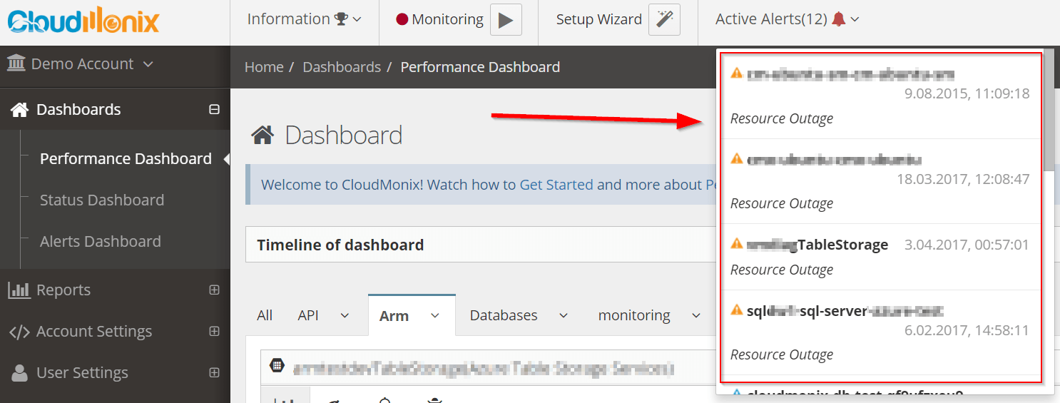
- The Alerts dropdown lists all alerts that are currently active. Clicking on any alert in the list will take you to the Historical Dashboard, that shows the state of your system as of the time when that the specific alert was triggered.

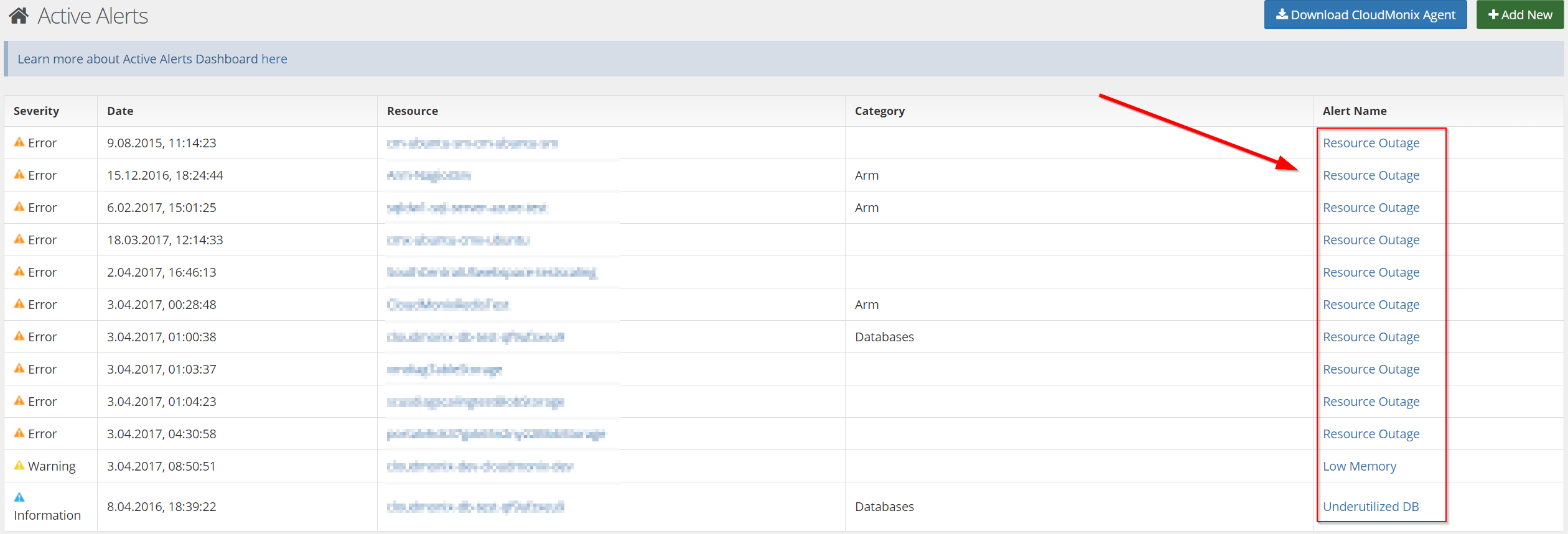
- The Alerts Dashboard also displays all alerts that are currently activated. Since it is an independent page, it can be easily monitored without user interaction.
Clicking on the name of any alert will also take you to the Historical Dashboard and visualize the state of the system as it was when the alert was triggered.
- The Status Dashboard visualizes current statuses of all tracked resources. The resources are organized in a tree-like structure.
The alerts with the highest severity are propagated up, which allows you to quickly spot issues.
Every resource with an active alert has a link to the Historical Dashboard, which will visualize the moment when the alert was raised.

Historical Dashboards make Root Cause Analysis sessions much more effective and shorter. Automatic Notifications, Alerts dropdown, Active Alerts Dashboard, and Status Dashboard will take you directly to the Historical Dashboard, so you don’t have to waste time looking when the recent problem occurred.
CloudMonix can save a lot of time when you’re investigating issues in your system, especially in complex Azure environments with many moving parts. Sign up today for a free account.


Leave A Comment